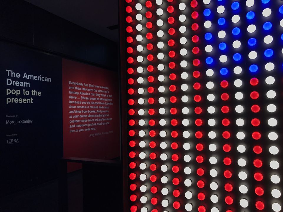
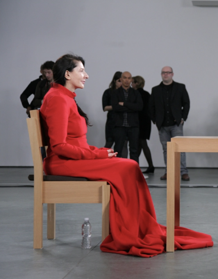
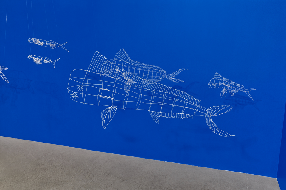
“The American Dream”, currently at the British Museum, is a colossal and almost overwhelming exhibit. It took me a full two hours to go through it and I still couldn’t see everything. It’s about the art, and also about the process of how art gets made. It’s also about the decisions that go into what constitutes art, and the practical execution of those concepts. It’s about the power of the image—whether a print or a painting or a sculpture or a torn-up bit of cardboard. It’s about the power of words—whether a word can ever be art, and how. It’s bewildering and fantastic and, on one level, an absolute triumph.
It starts badly, though. The first work exhibited is Bruce Nauman’s Pay Attention – which is a print of the words PAY ATTENTION MOTHERFUCKERS. As a call to action it is effective but this isn’t the sixties anymore. We are used to images, their repetition, and we are positively drowning in them (potty-mouthed or not) in a way that the artists of the sixties could not have imagined. The second and third pieces are major ones by Andy Warhol. In the same way that it is impossible to imagine film history without the influence of Citizen Kane, or The Matrix, it is impossible to imagine modern art without Warhol. Yet it is shocking to realize how their power has been diluted with the passing of time. Leaving aside his “fifteen-minutes of fame” curse, Warhol understood two things about being an artist better than anyone before or since. The first is: production can be just as important as the object. The second is: the way the object is marketed can be just as important as the object itself.
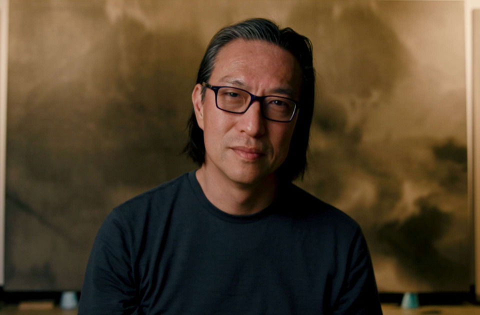
The exhibit knows both those things very well. Scattered throughout the exhibit’s twenty rooms are video interviews with various featured artists explaining their working techniques and the thought processes behind their pieces. Some of these clips are visibly modern, whilst others were clearly filmed at the time the work was created. There are also films showing the printing process for certain pieces, which is definitely intriguing, and as close to physically making a print that some of us will ever get.
When it comes to the marketing, the exhibit is a bit coyer. A great deal of fuss is made of the pieces by more famous artists—to name three, Roy Lichtenstein, Jasper Johns, and David Rauschenberg—and on the reception of their works at the time, their support networks, and the influence they had on how print work/collage was taken forward. The exhibit is so large that the emphasis on their work swallows the attention from work done by lesser-known artists, who are too numerous to list. There are sections devoted to the art of ideas, to the art of protest, and to art done with specific techniques such as line drawings. There is an enormous amount to see here.
But there is a theoretical mistake at the heart of the exhibition. Artists like Warhol and Johns, who were still students as World War II ended, were the right age to go straight into the art schools that exploded with the benefits and the energy of the GI Bill. The democratization of art via Pop meant that everyday objects could be considered masterpieces, prints were given equal importance to paintings, and even words could be items of absolute beauty.
However, the world’s relationship to the image is not what it was in 1950, or even in 2000. The social media explosion that has happened just in the last decade has democratized art in ways we couldn’t even dream of five years ago. Instagram and Snapchat filters have made the altering of images commonplace and instantaneous. Apps and computer programs mean that anyone can make GIFs, turn photos into memes, and manipulate images instantly in ways the Factory could only have dreamed of.
Many cartoonists don’t use physical pen-and-ink or watercolor anymore, but instead programs which replicate those looks perfectly. And none of this appears in the exhibit at all. Artists like Kara Walker, Julie Mehretu, and Willie Cole are held up as contemporary American artists, which of course they are and not least in the diversity they bring to the table—there isn’t a female artist featured in the first five rooms—but they are still working squarely in the context of non-digital methods and techniques.
In 1966 it was revolutionary for Ed Ruscha to strap cameras on either side of his car and photograph every shop front on Sunset Strip. But for a decade we’ve had Google Street View for almost every street in the developed world. There are cameras on every phone and we can watch live streams of anything, anywhere in the world. We can clip the best images and amend them to our heart’s delight. Images are pervasive and their manipulation even more so. It’s no wonder that the artists profiled at the end talk about their technique in nearly fetishistic terms. It’s obviously essential that, with their art school degrees and access to expensive equipment, they elevate themselves over bored kids in their bedrooms across the world.
Why does this exhibit ignore current pop artists completely? If this exhibit was about how acceptance of print as a technique has shaped the modern art landscape, it would work well. Same if it was about how to breach the gap between a conceptualization and object. Instead it seems as if it wanted viewers to have the same debate about high vs. low art all over again. What was once new, strange and startling is now passé and clichéd. Couldn’t we look at why these artists, who talk about their work in the language of an artisanal chef, have stuck to the old methods instead of pushing out into the new? And don’t the new artists, the current Pop players, deserve to have their work in this exhibit too? Their gaping absence points to a total failure to engage with how the world of art is in flux right now. The shift of art-world power from the galleries into the smartphones is invisible, but by the end of the exhibit it becomes about the only thing you can see.
But the final room makes that failure irrelevant. One of the most dynamic prints in the first half of the exhibit is Ruscha’s Standard Station—a deceptively simple print of a gas station. It’s all sharp diagonals (like you see in Soviet propaganda) and the primary colors of the American flag. The exhibit loops around on itself and in the last room is one of Ruscha’s newer works, Ghost Station, which is the shape of the print embossed on plain white paper. No colors at all. And it’s hung in such a way that if you look to the left, you can see Standard Station where it hangs across the space.
That’s the masterstroke of the curators: to show us not only that the American Dream is nothing but a ghost, but also that the art being created in this void has yet to receive its due.


