The snapshots of graffiti that are often seen on Tumblr or Instagram usually display drawings or stenciled sketches–the kind that pushed artists like Banksy into the limelight. But if you follow the history line of graffiti back to its beginning, you’d see how this fixation on pictorial elements was not always the case for graffiti. Graffiti was a matter of typography once upon a time; it still is today to those still honoring the art as something that grew from the practice of creating branded identity through paint strokes, approaching it not as an activity for the sake of spectacle, but as a craft where individual letters were drawn rather than written.
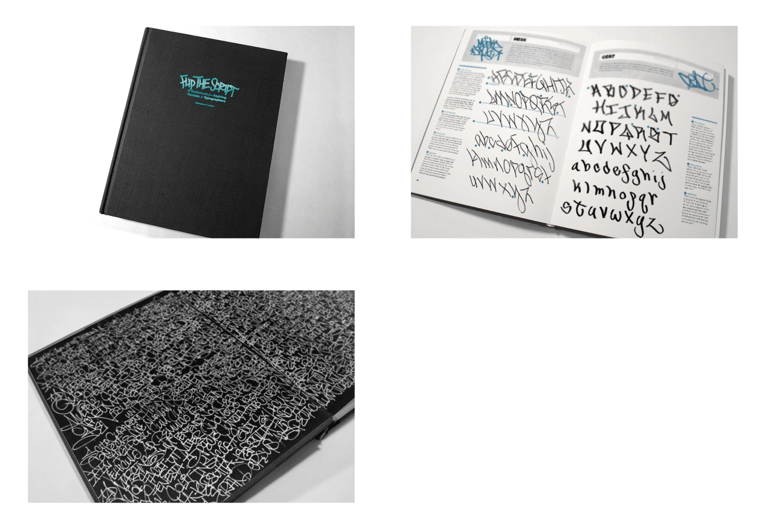
One individual from the Handselecta project, Christian Acker, paid homage to the art by publishing a book–Flip the Script–that analyzes hand styles across America, focusing on the original urban centers where graffiti was first popularized: Los Angeles, Chicago, Philadelphia, New York City, Baltimore, D.C., Boston, San Francisco, Seattle, and Miami.
Acker approaches typographic graffiti in a formal treatment, isolating each hand style for proper examination and places them cleanly between the pages of Flip the Script. They’re organized by city, with eight chapters dedicated to eight of the major cities and the artists who propagated the cities’ individual styles. Acker says:
Distinctive hand style lettering is an essential skill for artists and designers. Deftly executed hand crafted letter forms are a nearly forgotten art in an age of endless free fonts. Graffiti is one of the last reservoirs of highly refined, well practiced penmanship.
The most reviled and persecuted form of Graffiti, the tag, is seldom appreciated for the raw beauty of its skeletal letter forms. Most tags are removed immediately, and thus the casual viewer seldom has a chance to discern the difference between entry level and advanced hand styles.

Handselecta is an evolving project working to help showcase graffiti art and artists. The project seeks to get others to view “tagging” as a form of craftsmanship, as calligraphy. It serves first and foremost as a font foundry concentrated in the art of graffiti, documenting the progress of each graffiti artist’s writing style and history.
Their message to the world says:
We seek to educate the public unaware of the skill, style and practice that goes into the development of these letterforms & elevate the practice by enabling it to evolve to the next level. Just as calligraphy was the inspiration for generations of type designers past, today’s urban glyphs are the inspiration for a new typography of tomorrow.
For a book preview of Flip the Script, check out the video below.
Flip The Script – Book Preview from adnauseum on Vimeo.


